The funnel builder now has the new spacing component redesign. The new component now has less clutter and is more user friendly
🔥🔥
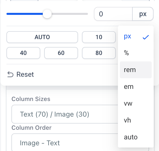
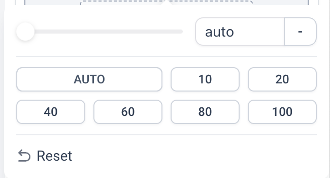
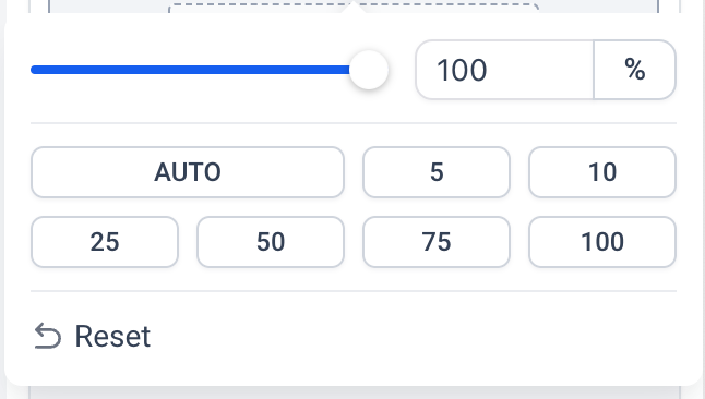
Users can now select a variety of units which includes:
🔥🔥
px
em
rem
%
auto
vh
vw
What's New 😍
The beloved slider is back! Based on the units the users select, the range of the slider would appropriately change.
A set of suggested values are present for each unit for quick selection. 🤩
How it looks ? 🤩
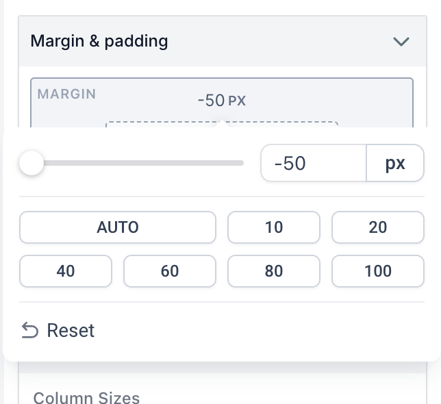
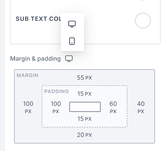
We're thrilled to introduce one of the most requested features for funnel and website builder. The ability to set margin and padding settings for mobile and desktop views. Now with an advanced customization option, you can set different margin and padding settings for mobile and desktop views, ensuring optimal and best design layouts for different screen sizes. We have made it easier than ever to build mobile-responsive funnels and sites.
🔥🔥
New Features:
🔥🔥
Margin and padding settings for mobile view
Enabled margin left and margin right for all elements
😍
Some example use case of this feature:
😍
Perfecting the look of grid layouts with different margin padding settings for mobile
Improving the visual layout and placement of elements for mobile
🤩
Major Paint point solved
🤩
Now there is no need to create multiple sections and keep different margin and padding settings in multiple devices and hide from one device.
🥳
How to Use
🥳
To change the margin or padding of an element in the new funnel builder and make it responsive across different devices, follow these steps:
Select the desired element in the funnel builder,
Go to the element settings and navigate to the Margin and Padding setting.
Adjust the setting for desktop. This change will also apply to mobile devices.
Click on the desktop icon to switch to the mobile view.
Change the margin or padding specifically for mobile. Note that this change will not affect the on desktop.
To modify the margin or padding for desktop again, switch back to the desktop view and make the necessary adjustments. This change will only affect the setting on desktop.
26 likes
